
A more formal writing of the notes I took during my close looking at Leonard Baskin’s Children and Still Life.
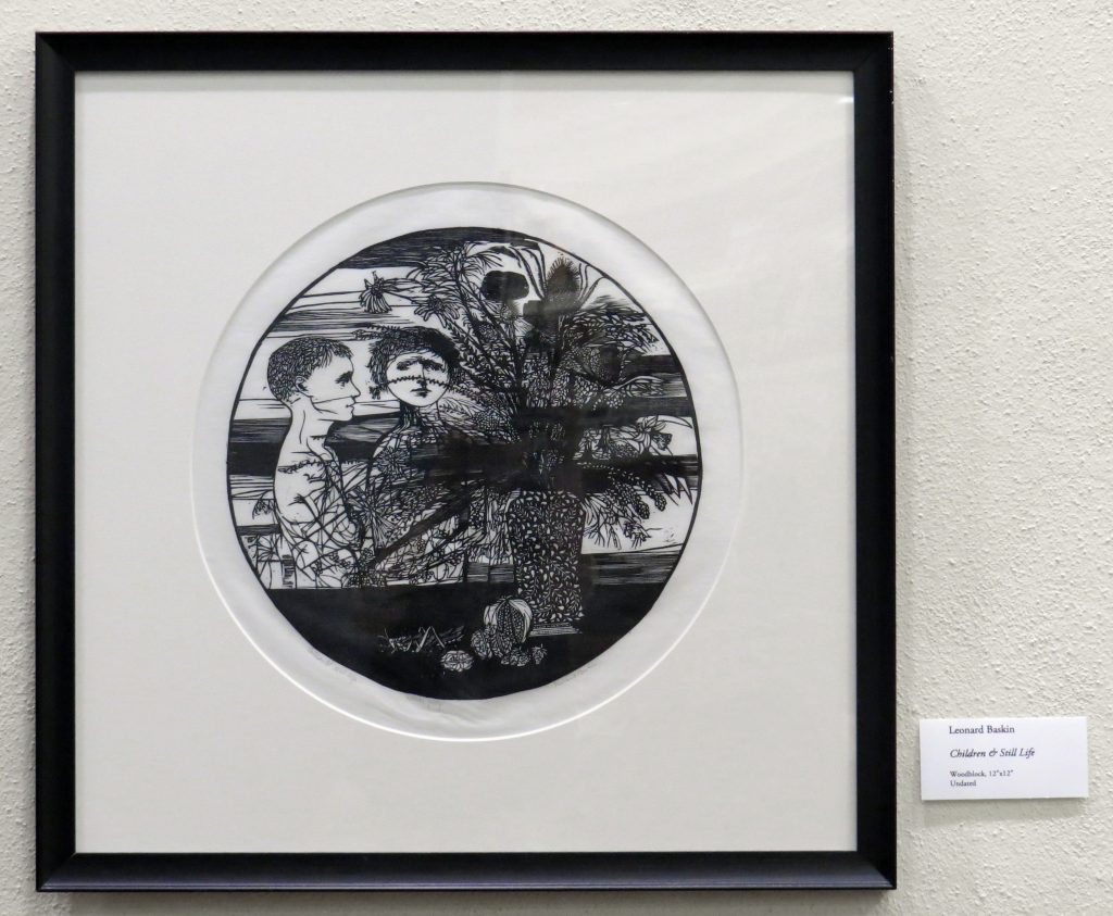
Baskin’s Children and Still Life is more or less what it says on the tin in terms of subject matter. Two children stand, half hidden, behind a vase of plants, while some fruits and nuts are scattered in the foreground, a cricket sitting there as well. The scene is entirely in blacks and whites, shading is done with hatching. The entire scene lies within a circle. This is a technically complete description, and if you have never seen the work you may now have a sense of it.
Such a simple description does not, however, explain everything that is going on, due to the complexity of all elements involved. For further understanding one might first look to the how line is used in the work, as it appears in a variety of ways within the piece to convey detail. The children are rendered comparatively simply to the rest of the scene, for one thing: Though their hairs are individual lines, their bodies and faces are minimalist in appearance, in stark contrast to the vase of flowers in front of them, which have every stem and petal detailed, even down to individual prickles on the thistle head. There is furthermore an intricate pattern on the vase itself, solidifying it and the flowers as a unit and making the children a separate object.
Beyond line, the use of solid shapes of black and white to divide space is a major design element of the print. The table upon which the still life sits is solid black, for instance, and bands of black streak across the background, in some cases continuing into the flowers. The solid black creates a distinct foreground, while the stripes unify the background. This complements the differences in line between the flower vase and the children, serving to bring the dark of the vase more forward into the solid black while pushing the light of the children into the background.
It would be interesting to talk about the children more- what are their expressions? How are they being portrayed? Where are they looking? What are they wearing/look like? How are they positioned? Why are they there? Also, the shape of the artwork is interesting. How does the circular frame change the work from the traditional style of art?
While the overall analysis is good for a rough paragraph, it has its grammatical errors in here. For example, there is one part where there is an extra space between the words scene and for. I appreciate the transitions from the description from the analysis, however, I wish you would go into the analysis a bit more. The description appears to have more meat to it. The analysis is a good read, but if you have time to add some more details to your analysis. What else could this picture mean? Did you only have one sole idea for this analysis? What else do you see? Also, I wish that you could have uploaded the picture for me to see as I would love to see these ideas that you are talking about. I can’t wait for your presentation! Good luck!
Thanks for the feedback Rose 😀
There’s only one space between scene and for, it might look like more because of the font though. Of course it’s also possible that I’m looking at the wrong thing. If you could let me know which specific sentences have errors in them it would be greatly appreciated.
Great description, you can really get a sense of the piece and some key design elements that I am excited to hear analyzed.